Thursday, April 16, 2015

Our Kitchen and the Inspiration

Oh, kitchens. I feel like they are the heart and the soul of the home.  Typically, this is where everybody gathers and hangs out...like it or not.  And, even if you do not love to cook...you tend to be in there a lot (you have to eat) and if you have kids...you pretty much never leave the kitchen (at least that's how I feel sometimes:)).  So, if possible, you better make this room as appealing as possible.

I wanted our kitchen to have a cottages' rustic charm with some modern elements to make it stylish. I wanted it to feel like this had been a cool house with charm that had always been here (like a farmhouse) and we just kind of moved our furniture in.  Well, if you look back at the remodel it was not a cool house.  It was a 1969 ranch house that had undergone some funky remodels and the other parts had not been touched since 1969.  In other words, there was nothing cool about it.  Except for the floor plan and the location.  And, these are pretty important, my friends!! Everything else you can change...ha ha:)

SO, here has been some of my inspiration over the years...I crave a feeling more than anything.  To me, decorating and remodeling is about conveying a feeling that you want to strive for.  How do you want your home to feel?  I wanted mine to feel modern and rustic meets farmhouse and bohemian.  This is what makes me feel good and comfortable.

First up is this kitchen by Brooklyn Home Company. I think it is a perfect example of modern meets rustic.  Love the soapstone countertops with a more modern white cabinet with the rustic wood contrast.  Yep, pretty perfect:)


Close up of the kitchen above

I knew for a while that I wanted barn wood for backsplash but this kitchen by Jessica Helgerson pretty much sealed the deal.  Again rustic wood with some more modern cabinets and you throw in a bunch of charm is ideal in my book.


Beautiful kitchen by M. Elle Design as seen in Elle Décor. My favorite elements are the countertops, wood ceiling and basket lighting. This design team does everything spot on!!


My all time favorite kitchen from a movie would have to be the one from It's Complicated. Well, nothing in my kitchen really looks like this except for maybe the woven blinds but it is about a feeling.  This is one of the most charming kitchen's I have ever seen. And while Miss Meryl Streep's character wanted to remodel it...I would not have changed a thing.


And here is a Wendy Young kitchen .  Love everything about it but especially the chunky black countertops and white cabinets.  Love that beam going across and that light is amazing!!


Daryl Carter's kitchen below from Elle Décor ...well just perfection!!


Love this inspiration from Remodelista.  Again, in my eyes, it does not get much better than some barn wood, concrete countertops, a little white, a little gray, some brown and of course a healthy dose of some antlers :)


A close up of the kitchen above


I love the wood island and table against the white below from Elle Décor


This sink pretty much sold me on concrete


The two kitchens below look nothing like my kitchen but had to throw them in the mix because they are just so beautiful and convey a very charming feel.  The first image is from House Beautiful.


Below is Carolyn Murphy's home


Now on to our kitchen...hello orange cabinets!!

A before


And now...


What do I love about our kitchen? The concrete countertops, for sure!! I was super worried about the durability factor and I have been very pleasantly surprised. I highly recommend them if you have a good fabricator. I am also so happy with the wood backsplash. The look of the barn wood gave me the "mood" I was striving for. And the creamy white paint of the cabinets against the dark countertops...I would definitely do that again!!
 
What would I have done differently?
 
1.)Replace the cabinet doors. This was a budgetary constraint. After all, you have to stop somewhere!! I am hoping that this is something we can do in the next few months.  We would like to go to more of a shaker style like this...


2.) The light over the sink.  It is fine and cute but I would like something with a little more power (style wise). I love this one by Cisco home. I think it would give this little kitchen what it needs. I had the larger ones in our family room in our previous home and these lights are pretty special.


Or I would have moved the electrical to the wall for a sconce.  Like this beauty from The Urban Electric Co.


3.) While I am happy with the concrete countertops for the island, I may have used another stone like marble to break it up a bit.  Even though, we did paint the island a blue/gray which does the trick and we have enough other things going on in there...sometimes I wonder if I should have used another material.

4.) Last but not least I probably would have painted the whole house white.  I love the neutral greige in person but it just does not photograph as well as white. It looks a little yellow in the photos and it does not look like that in person.  It is kind of silly but we all know how obsessed people are with photographs these days.  That is a whole separate issue that I will touch on one of these days.

There you have it...the little kitchen that could be transformed from those orangey cabinets and a sea of wallpaper into something that makes us pretty darn happy:) And, every time I walk into it reminds me of a charming little cottage that has always been there.  And, I am hoping that one of these days it inspires me to be a really good cook...not sure if that will ever happen....but my fingers are crossed!!

xo ,
Paige

Friday, March 13, 2015

Gallery and art walls

I have had picture and gallery walls on my mind a lot lately. As we all know, this is not a new design phenomenon and has been labeled quite trendy as of late .  While an art wall is an art wall, there are so many different ways to display your favorite things so, in my opinion, they all end up looking quite different. We, after all, covet different types of art and treasures and obviously have different photographs. This is the beauty in it.   In any business, especially with creative types, people are always trying to come up with something new and reinvent the wheel. Well, in my opinion "if it ain't broke, then don't fix it".

And gallery walls have been a thing for many years.  It was not some savvy designer 5 years ago that had this bright idea.   As also in fashion, history usually repeats itself. Oh hello leggings and high waisted jeans.  And, how many girls these days look like they would fit right in at Woodstock? I remember walking into my Grandmother's urban apartment 30 years ago and she had beautiful oval black and white photographs grouped together on a wall..hmm I would certainly call that a gallery wall.

At this point, I have not collected enough of "like kind" art to make a killer art wall but it is definitely on my to do list.  I do, however, have plenty of family photographs that I have transformed into a picture gallery wall in our office.

In my opinion, when you have enough of one thing it makes a pretty bold statement.  The common theme in our office is that they are all family photos and all of the frames are black. Picture and art walls equal happiness.  It is about bringing some of your favorite things together to make a statement.  When I am sitting at my desk and I look up at our gallery wall..it definitely puts a smile on my face.  And I love it when our guests check it out too..it usually puts a smile on their face, as well:)


Below is a roundup of some of my favorite gallery and art walls around the internet and in magazines.

I love this family photo wall, I believe by Jennifer Delonge from Domino way back when. 


This is another beautifully executed wall with classic look of black and whites with a mixture of family photos and art. From Pinterest.


Oh, how I heart the picture ledge.  Not only do they look incredible but it would be so fun to switch them out and around as you please.  Elle Décor.

 
From Pinterest
 

From Pinterest
 
This combo below is pretty spectacular...does it get any better than a photo ledge and bookshelves...I don't think so!! 
 

The two rooms below would be pretty awesome to walk into..so much to look at and check out on the walls. And it does not hurt that both rooms have great architectural detail. They both do a beautiful job of combining lots of good stuff with apparently no theme and making it look really good!! Both images were found on Apartment Therapy.


I am pretty obsessed with the feel of the below three rooms...like hyperventilating obsessed!  All three are from Pinterest.


Image below via Pottery Barn...love the different photos but in matching frames against the barn wood. Great juxtaposition of different styles.

 
The one below is a pretty perfect vignette ...vintage portraits, antlers, creams, browns, wood, and a horse pillow:) From Pinterest.
 
 
While the art below is not on a wall, one cannot deny the beauty of its display. Elle Décor.


Hope you enjoyed these great walls and rooms!!
 
xo, Paige

Sunday, March 1, 2015

Professional photos...part 2

So, here is the second round of photos... some before(s), of course, and Meredith Park's pretty after photos.
 
 As I have mentioned before, the guest room is my favorite room in the house.  The high beamed ceilings, the white walls and the hardwood floors make it pretty lovely to photograph. 
 
The guest room...we painted creamy white by Sherwin Williams, added hardwood floors, changed out the lighting and used primarily leftover furniture. And here is the room now...


And this is what the guest room looked like before we got our hands on it....


And the guest bath now...we added slate tile, a wood base console with a concrete countertop.  My brother in law made the base and our painter gave the wood an antique look. The driftwood mirror really completes this space as this room feels like it could be indoors or outdoors.

 
And a before...
 
 
And below is my son's room...we used wool carpet in here for the softness and layered it with a cowhide rug. The bunk bed is from Restoration Hardware, the drawers are from Anthropologie, the chest is antique, the fabric for the window shades is from Ballard Designs and I had them custom made locally. And, as you will see the animals love this room.  Especially, our cat, Leo, who can escape from our pup to the top bunk:)


 And this is what my son's room looked like before...
 

And, my son's bath room is probably one of the biggest transformations in the house.  Let's just say it is not pink anymore and there is no longer dirty carpet...yuck!!


And, a before...


It's funny how when we were knee deep in the remodel...it did not seem like we were doing that much.  It was just so fun making the home look better and reach its potential. When I look back at the before pictures it reminds how far we have come.

I remember seeing the look on my parents face when we brought them by mid-remodel.  They tried to hide their shock:)  I believe their thoughts were not necessarily that this is the most horrible home (well maybe they thought that) but how are they going to transform this into a comfortable and warm home for their grandchildren.  Well, I thing we have succeeded at that and in their defense, things have to look worse before they look better!  Here is a photo mid-construction...not super welcoming!


Hope you enjoyed this second round.  I will be back soon for more.

xo,
Paige


Wednesday, February 25, 2015

Professional pictures:)

So, I finally had professional photos taken of our house...yay!!  I kept putting it off because "Is your home ever really done!!"  Ours is not but I finally bit the bullet.  We did not move in to a "done" house.  To recap, we bought an old tired fixer upper and poured our love and money into her!!  We spent so much money on the big stuff, i.e. roof, driveway, flooring, etc.  that the decorating has had to move at a bit of a slower pace.  At least, we never have to worry about a roof leak:)  Oh, yeah, that's not really a big worry in San Diego anyways...ha ha. We still do not have some blinds and drapes in some of the rooms and I am still negotiating with my husband on some perfect art work...but we are at the point where we could at least have some photos taken.

Our friend and fabulous photographer, Meredith Park, took the photos. She is a family and lifestyle photographer in San Diego. I love the brightness and crispness of the photos...that does not really happen with the iphone!!

Below is Part 1 of the little home tour:)  All pretty photos are by Meredith Park and all before photos are by moi or are from the MLS. There is more detailed information about what we did to each room on previous blog posts if you are interested.

Our home has a fairly open floor plan...when you walk in you pretty much see everything except the kitchen and the bedrooms.  The foyer consists of some benches and a side table and a mixture of art...modern and antiques. And rugs.  My husband thinks we have too many.  I think not enough. The office is on the right and the dining room is on the left and the living room is straight ahead.  It is a ranch style home which makes for some pretty easy living!! The barn wood floors really changed the feel of this home to give us that warm and rustic feel we were craving.


Below is what the foyer and the dining room used to look like....


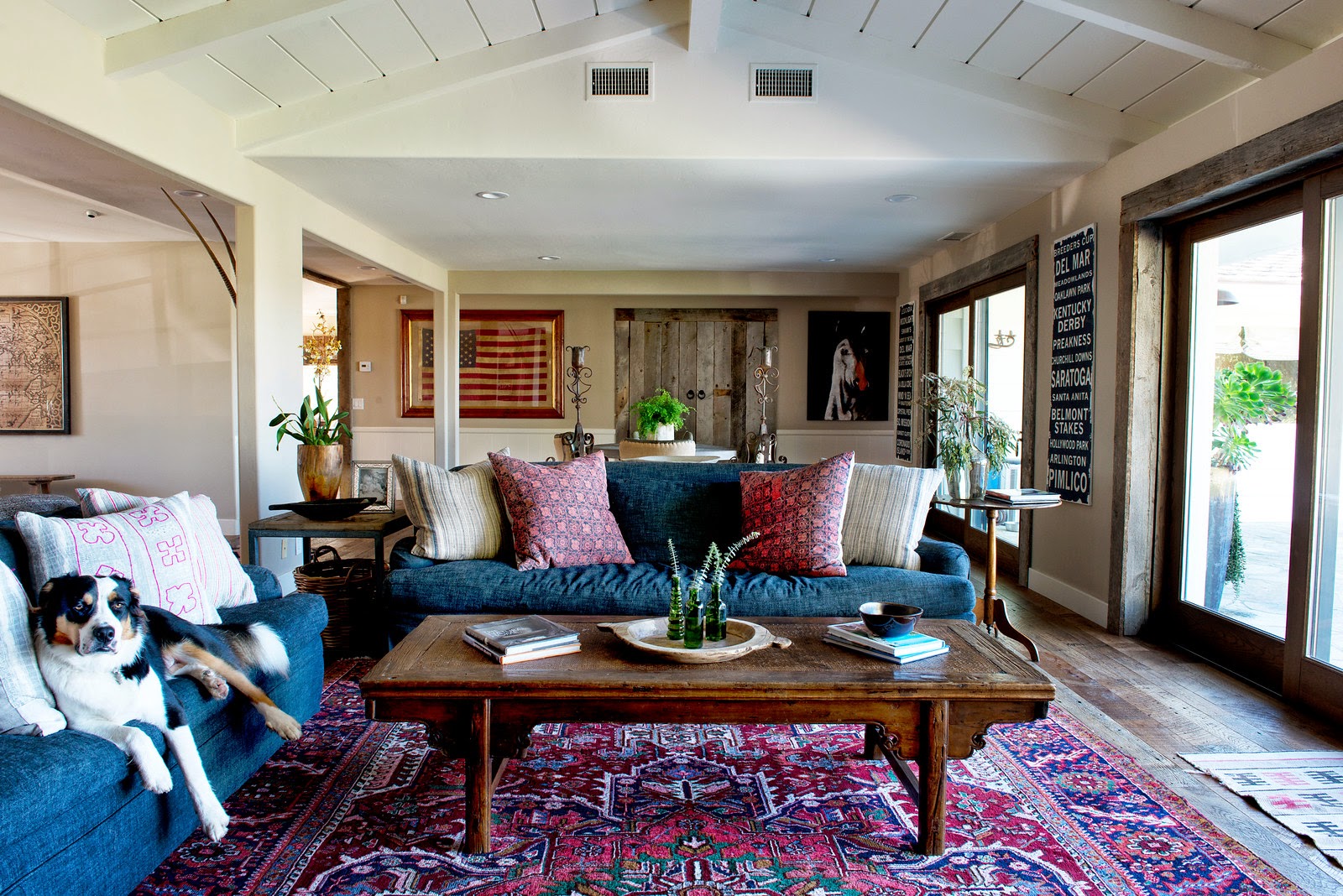
This is our family/living room now.  The most impactful changes to this room were 1.) to fill in the sunken living room (which screamed 1960's) and also gave the room a larger yet more cohesive feel. And, 2.) we added a Kolbe pocket door system that completely opens up which is perfect for our mild and sunny California weather:)


And here is a before of the living room...
 
 
Our kitchen...


All I can say here is creamy white paint.  Those cabinets certainly needed it. White paint does wonders!!  And, we used a pretty grayish blue for the island and the existing built in cabinets as contrast.  We used reclaimed wood as well as concrete for backsplash and concrete for the countertops. The woven blinds are from Home Depot and the drum light in the kitchen nook was one of my first big home purchases over 8 years ago.  It has traveled with us to 3 homes.  I do love it but it is a sentimental issue more than anything!
 
And, here is a before...


Hope you enjoyed Meredith's pretty pictures.  Her website is https://www.mparkphoto.com.  Check her out if you are in need of any photography!! I will be back soon for the rest of the tour. Thanks for checking it out!! xoxo