Thursday, April 30, 2015

The Entry Way

Entry way as defined by the Encyclopedia; "An entry way is a hall located at the front entrance of the house. An entryway usually has a coat closet, and usually has linoleum or tile flooring". It goes on to say "that many houses do not have an entry way...in these the front door leads directly into the foyer or some other room in the house".

I chuckled a little bit with the linoleum flooring...only because it is a little dated.  It is funny to think that linoleum used to be all the rage.  I also love that it says that many houses do not have an entry way.  This is still true  and I love how efficient and creative homeowners have become.  If they do not have one...they simply make one with maybe a console, some hooks to hang things on and a little picture wall, mirror, or hats. Long gone are the days of hall closets.  Sure, many homes still have them but a lot do not. It has become quite accepted and stylish to see boots, hats and coat mixed in as part of the design.

One of my favorite entry way's is this one by Tom Scheerer.  Not only is it beautiful and charming but efficient.  To have your hats at the front door is pretty smart as you can just grab one as you are walking out and it looks beautiful at the same time.  Hats might be the next art wall:)  Yes, probably one of the most charming entry's ever!!  The white walls, the brown wood, the hats, the lantern, the textures...love!!


The image below is from Fieldstone Design. I think everything about this space is beautiful.  And, big kudos to the designer for making a little entry when there is not a proper one.  By placing that little table (and such a darling vignette that it is) it gives the feel of an entry and gives the homeowner a place to set down keys, mail, etc.

 
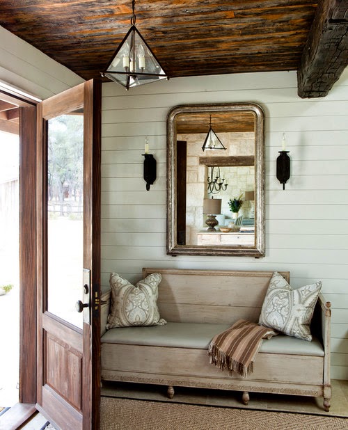
Image from Town and Country Living.  Yes, please, I will take it all. The planked walls, the barn wood ceiling, the sconces, and the seating.  Lovely.


I think it is fair to say that Heather Bullard's entryway is at the top of everyone's list.  She is an amazing designer, stylist and photographer.  Just beautiful.  I think my favorite parts of this are the black dutch door, rug, and white wood  flooring.
 
 
This image is from Brunch at Saks BlogSpot. I love how a narrow hallway was transformed into the cutest entry eva!!
 
 
Even though this photo is a bit dark...it is still so charming and efficient.  I mean really all you need is a coat rack, a bench and if you are lucky a cute door and lighting:)
 
 
So pretty from Pinterest
 
 
I did a previous home tour on this lovely house of Chay Wike's. This image is from Apartment Therapy.  This is one of my favorite houses of all time!
 
 
From Pinterest...stunning styling!
 
 
Now, on to our house.  I probably should have put ours first because after all these beauties..well you know. And, I only have a couple of photos that are properly photographed.  The others are iphone pics.  So, we have a different situation.  Our entry way is kind of too big.  I am not complaining but it was  a lot to furnish.  Instead of maybe one console and some art work...I had 4 walls to fill!!  So, I filled it with some of my favorite things...benches and art work.  Benches are probably the least expensive piece of furniture I have found and personally I think they make as much of an impact as a console.  So, here it is..in a couple of photos because the space is too big to capture in one!! And probably not that efficient!
 
Photo by Meredith Park
 

Photo by Meredith Park
 
 
I phone pic
 
 
I phone pic
 
 
The above rug is too small for the space but I was trying it for color and texture.  I absolutely love it...just needs to be a couple of feet bigger on each side. I have also since changed the art work around but you can get the idea. 

I am really happy with our entry as it houses some of my favorite things.  But all you really need is one small wall or hallway to make it the most charming entry.  After all, you never get a second chance to make a first impression:)

xo,
Paige

Thursday, April 16, 2015

Our Kitchen and the Inspiration

Oh, kitchens. I feel like they are the heart and the soul of the home.  Typically, this is where everybody gathers and hangs out...like it or not.  And, even if you do not love to cook...you tend to be in there a lot (you have to eat) and if you have kids...you pretty much never leave the kitchen (at least that's how I feel sometimes:)).  So, if possible, you better make this room as appealing as possible.

I wanted our kitchen to have a cottages' rustic charm with some modern elements to make it stylish. I wanted it to feel like this had been a cool house with charm that had always been here (like a farmhouse) and we just kind of moved our furniture in.  Well, if you look back at the remodel it was not a cool house.  It was a 1969 ranch house that had undergone some funky remodels and the other parts had not been touched since 1969.  In other words, there was nothing cool about it.  Except for the floor plan and the location.  And, these are pretty important, my friends!! Everything else you can change...ha ha:)

SO, here has been some of my inspiration over the years...I crave a feeling more than anything.  To me, decorating and remodeling is about conveying a feeling that you want to strive for.  How do you want your home to feel?  I wanted mine to feel modern and rustic meets farmhouse and bohemian.  This is what makes me feel good and comfortable.

First up is this kitchen by Brooklyn Home Company. I think it is a perfect example of modern meets rustic.  Love the soapstone countertops with a more modern white cabinet with the rustic wood contrast.  Yep, pretty perfect:)


Close up of the kitchen above

I knew for a while that I wanted barn wood for backsplash but this kitchen by Jessica Helgerson pretty much sealed the deal.  Again rustic wood with some more modern cabinets and you throw in a bunch of charm is ideal in my book.


Beautiful kitchen by M. Elle Design as seen in Elle Décor. My favorite elements are the countertops, wood ceiling and basket lighting. This design team does everything spot on!!


My all time favorite kitchen from a movie would have to be the one from It's Complicated. Well, nothing in my kitchen really looks like this except for maybe the woven blinds but it is about a feeling.  This is one of the most charming kitchen's I have ever seen. And while Miss Meryl Streep's character wanted to remodel it...I would not have changed a thing.


And here is a Wendy Young kitchen .  Love everything about it but especially the chunky black countertops and white cabinets.  Love that beam going across and that light is amazing!!


Daryl Carter's kitchen below from Elle Décor ...well just perfection!!


Love this inspiration from Remodelista.  Again, in my eyes, it does not get much better than some barn wood, concrete countertops, a little white, a little gray, some brown and of course a healthy dose of some antlers :)


A close up of the kitchen above


I love the wood island and table against the white below from Elle Décor


This sink pretty much sold me on concrete


The two kitchens below look nothing like my kitchen but had to throw them in the mix because they are just so beautiful and convey a very charming feel.  The first image is from House Beautiful.


Below is Carolyn Murphy's home


Now on to our kitchen...hello orange cabinets!!

A before


And now...


What do I love about our kitchen? The concrete countertops, for sure!! I was super worried about the durability factor and I have been very pleasantly surprised. I highly recommend them if you have a good fabricator. I am also so happy with the wood backsplash. The look of the barn wood gave me the "mood" I was striving for. And the creamy white paint of the cabinets against the dark countertops...I would definitely do that again!!
 
What would I have done differently?
 
1.)Replace the cabinet doors. This was a budgetary constraint. After all, you have to stop somewhere!! I am hoping that this is something we can do in the next few months.  We would like to go to more of a shaker style like this...


2.) The light over the sink.  It is fine and cute but I would like something with a little more power (style wise). I love this one by Cisco home. I think it would give this little kitchen what it needs. I had the larger ones in our family room in our previous home and these lights are pretty special.


Or I would have moved the electrical to the wall for a sconce.  Like this beauty from The Urban Electric Co.


3.) While I am happy with the concrete countertops for the island, I may have used another stone like marble to break it up a bit.  Even though, we did paint the island a blue/gray which does the trick and we have enough other things going on in there...sometimes I wonder if I should have used another material.

4.) Last but not least I probably would have painted the whole house white.  I love the neutral greige in person but it just does not photograph as well as white. It looks a little yellow in the photos and it does not look like that in person.  It is kind of silly but we all know how obsessed people are with photographs these days.  That is a whole separate issue that I will touch on one of these days.

There you have it...the little kitchen that could be transformed from those orangey cabinets and a sea of wallpaper into something that makes us pretty darn happy:) And, every time I walk into it reminds me of a charming little cottage that has always been there.  And, I am hoping that one of these days it inspires me to be a really good cook...not sure if that will ever happen....but my fingers are crossed!!

xo ,
Paige